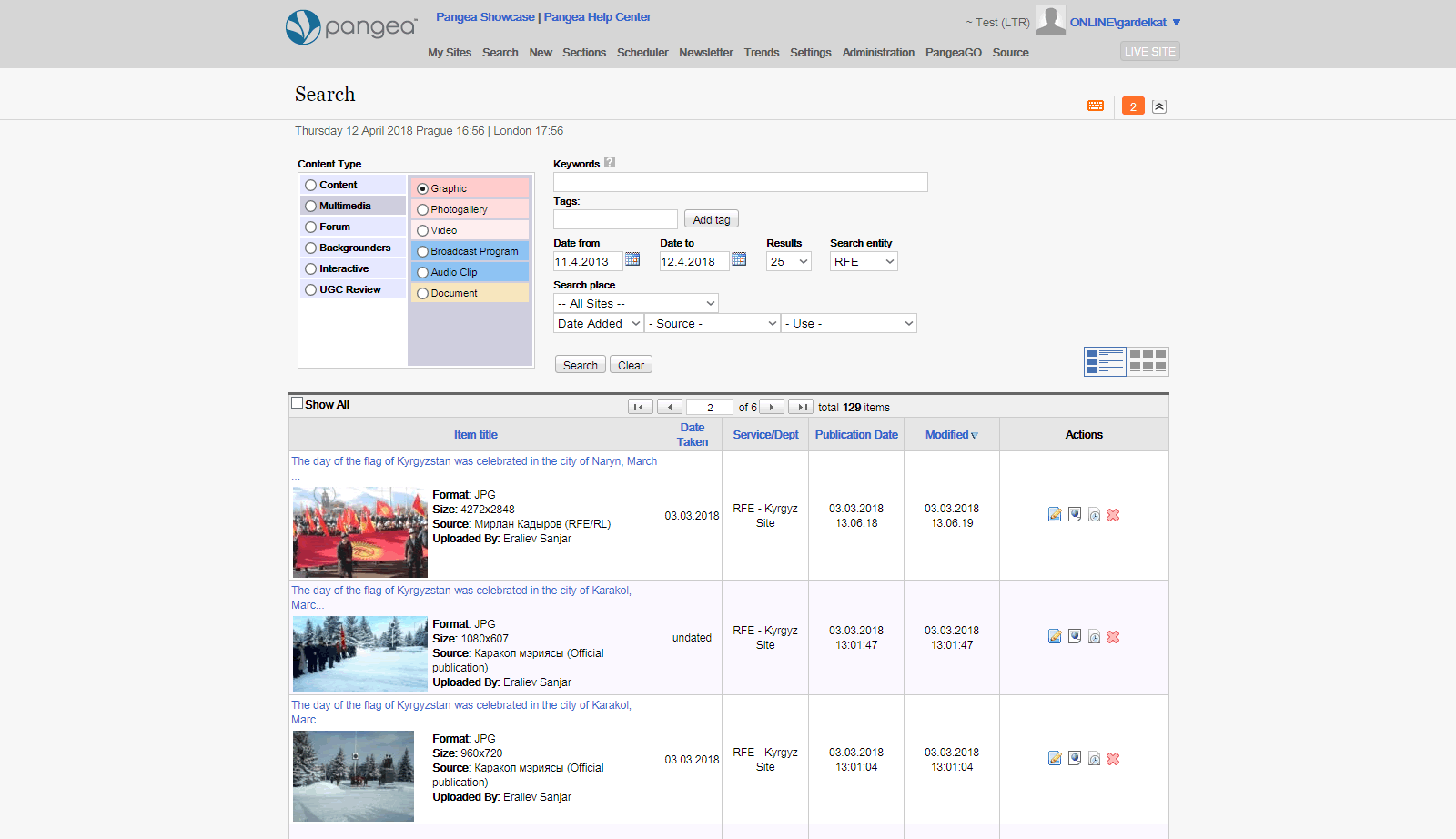
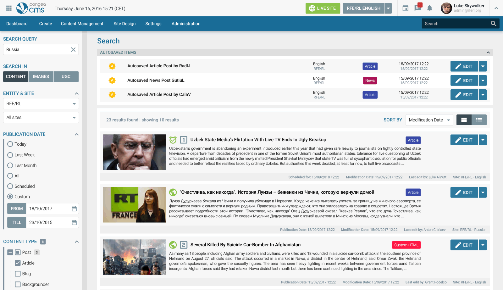
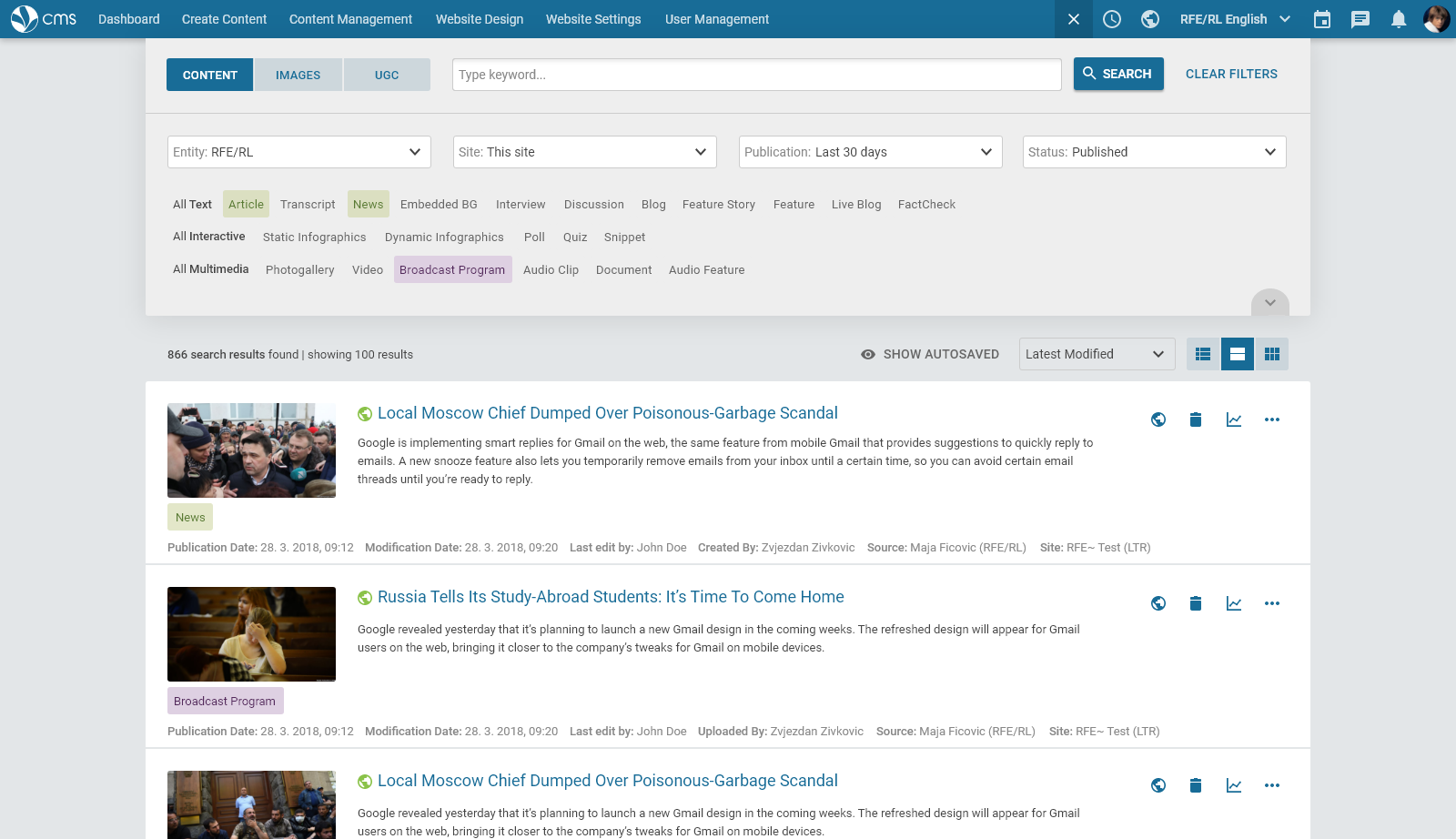
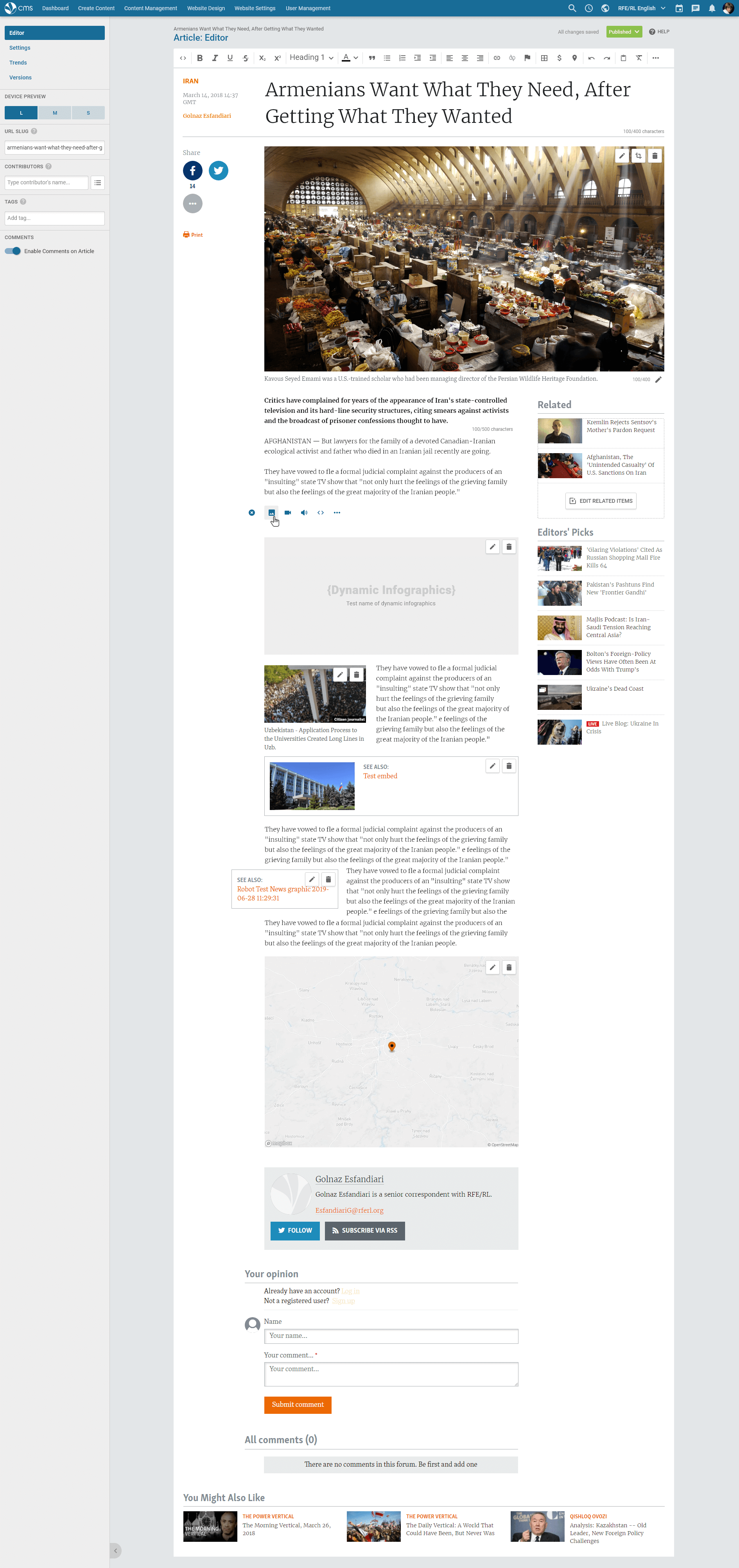
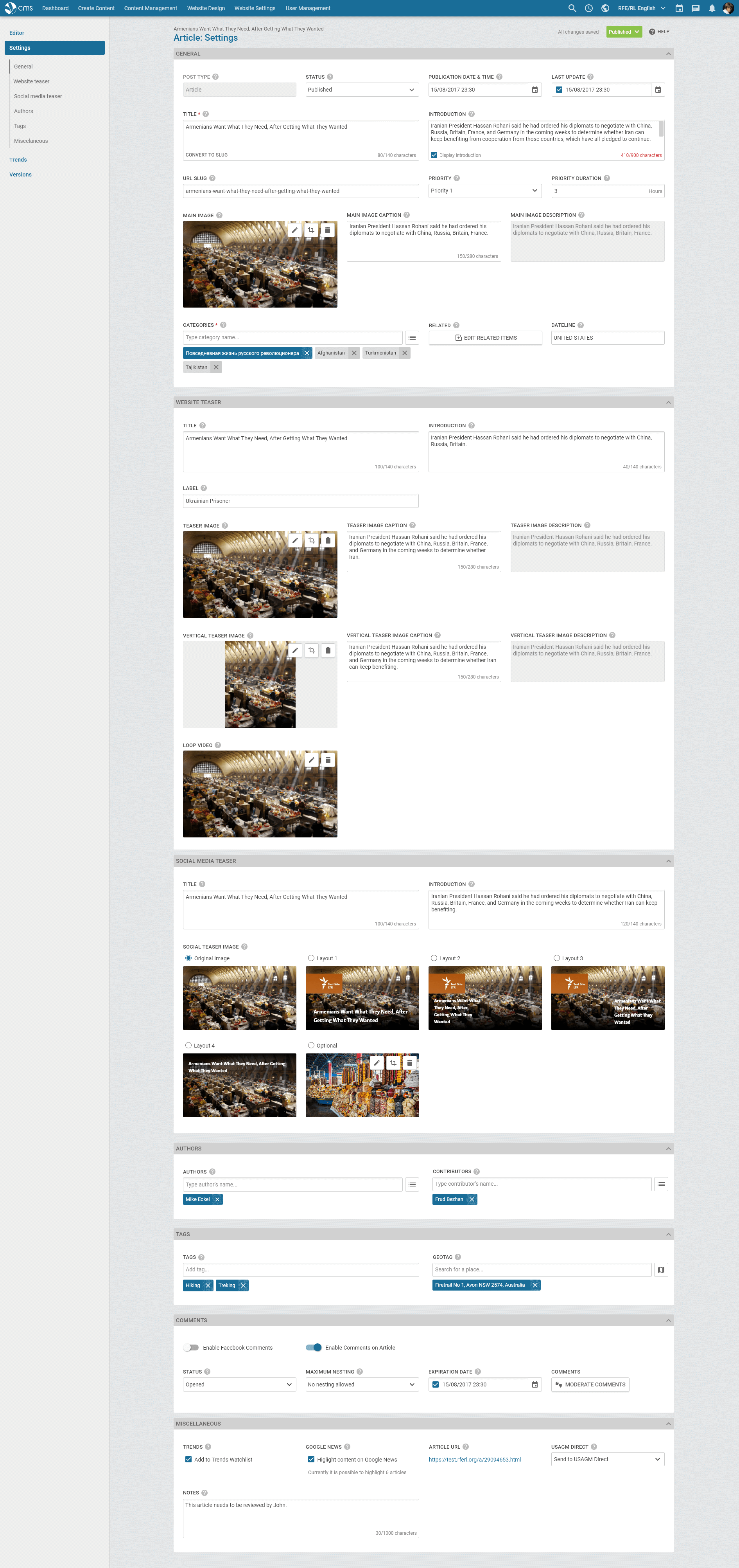
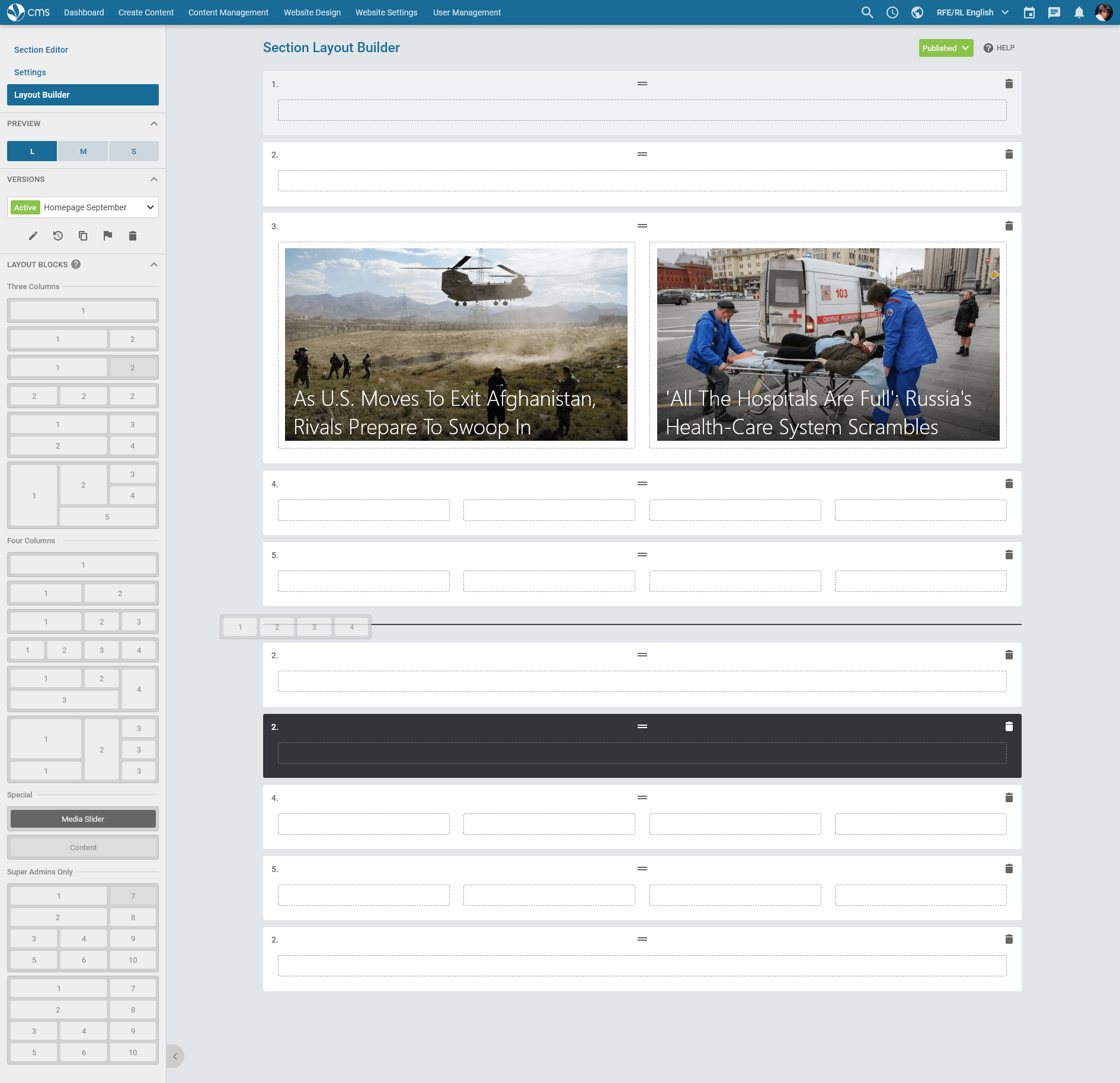
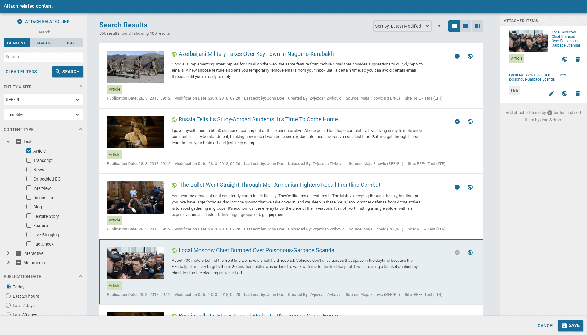
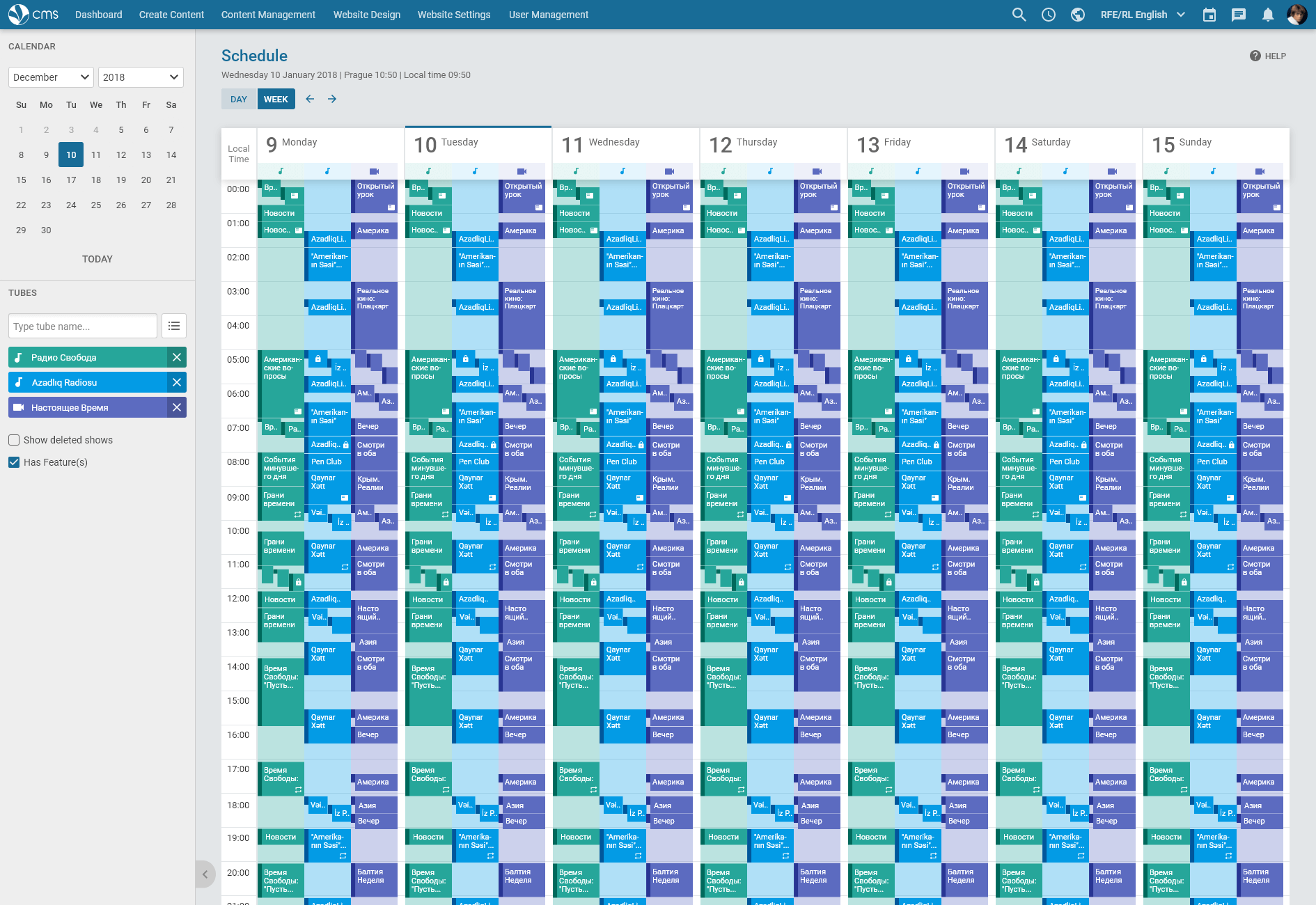
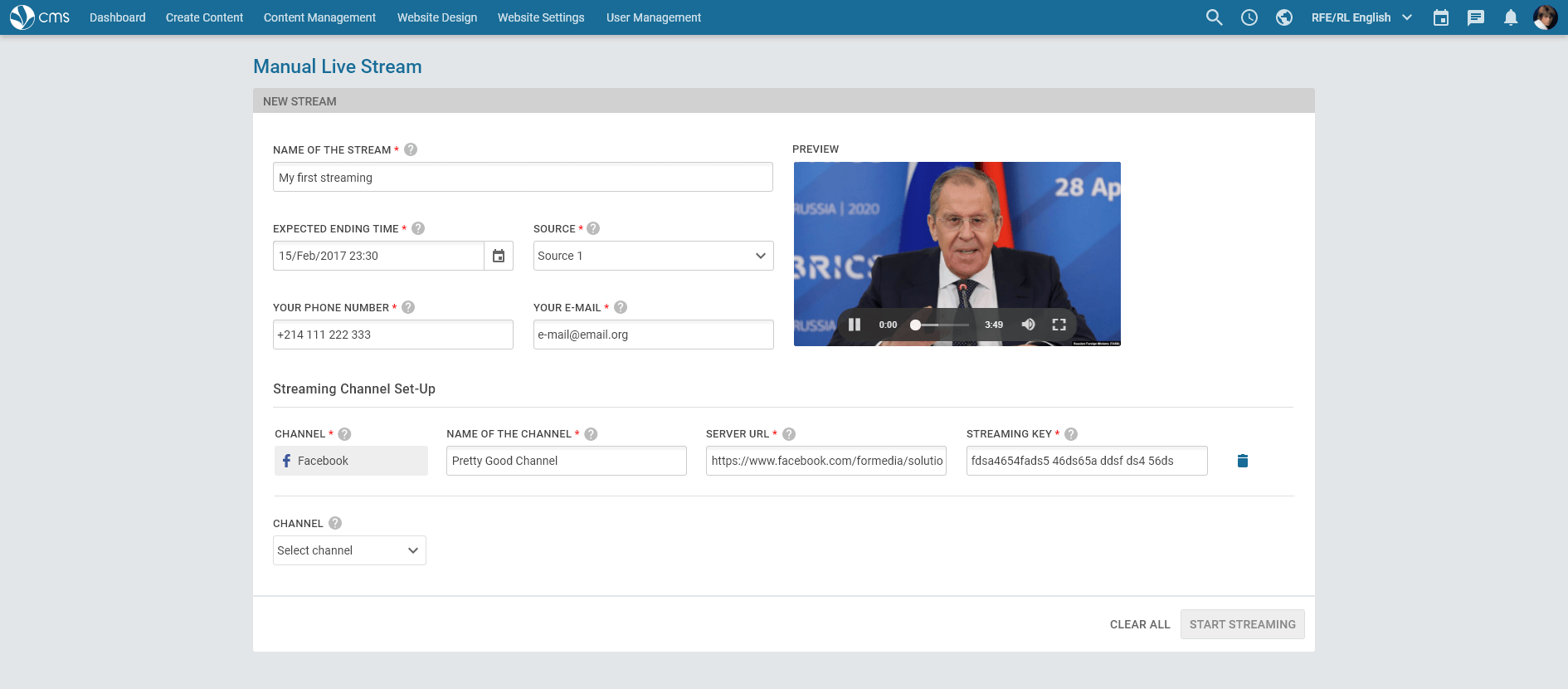
From 2018 to 2020 I was responsible for the complete overhaul of “Pangea CMS”, a web-based enterprise publishing system, used every day by thousands of journalist, publishing news in 57 languages across 200 countries and territories worldwide. I spent more than one year working independently and then working in a three-member team of designers.
Initial situation
The story of Pangea CMS began in 1999 when the first RFE/RL automated website launched. Since then, the project grew into a large system serving not only to RFE/RL but also many other USAGM entities like Voice of America or Alhurra. CMS redesign project started in late 2016 when my colleague made initial mockups for a presentation in Washington, D.C. Shortly after, the team was forced to start with development. Unfortunately, without enough introductory analysis, without proper UX research and proper design system. One has to come to terms with the fact that this is how things go in governmental institutions sometimes. When I inherited the project after my colleague designer who left the team in the midst of 2018, it wasn't a big surprise that there was a lot of space for improvements.
Design system overhaul
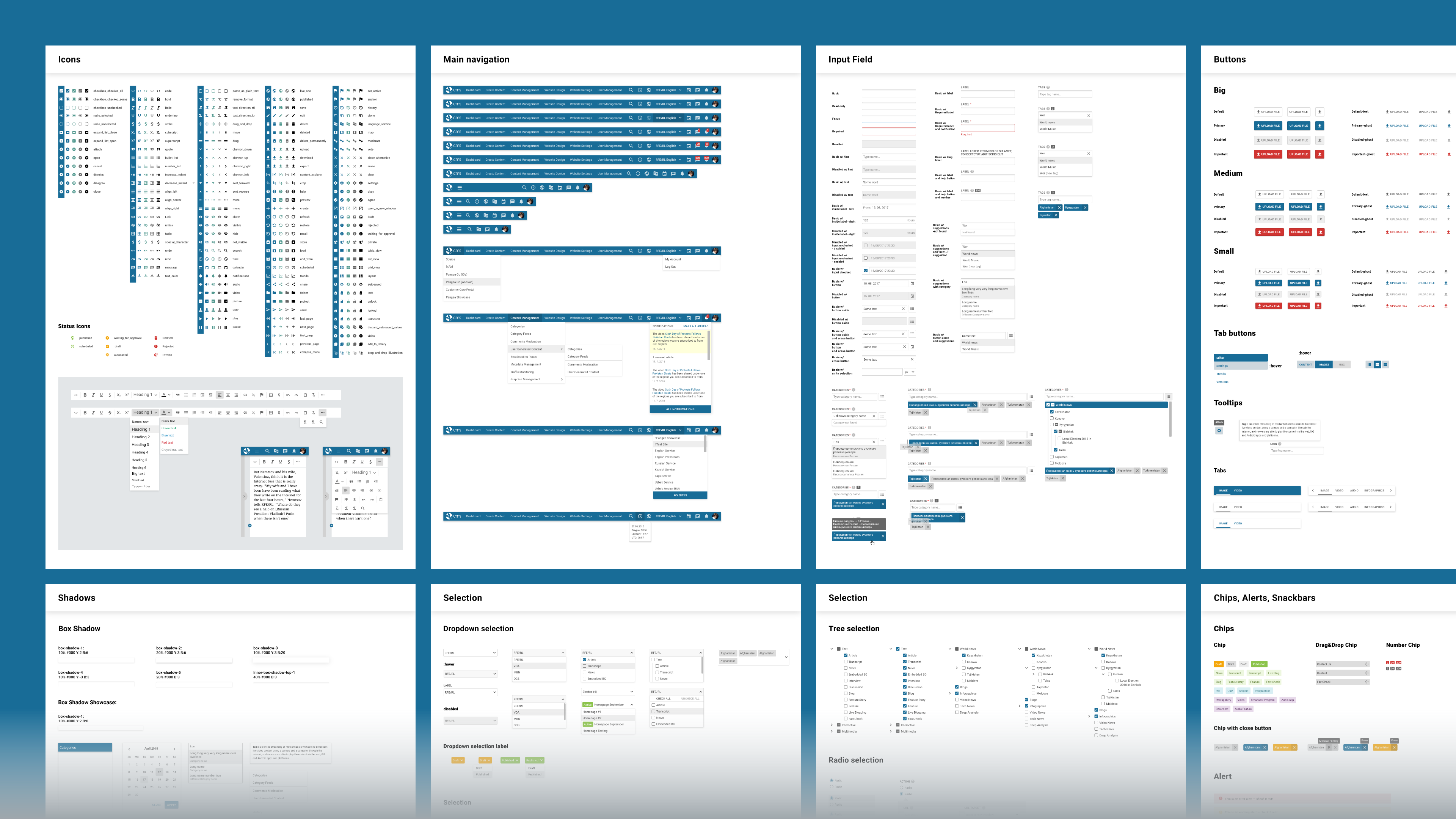
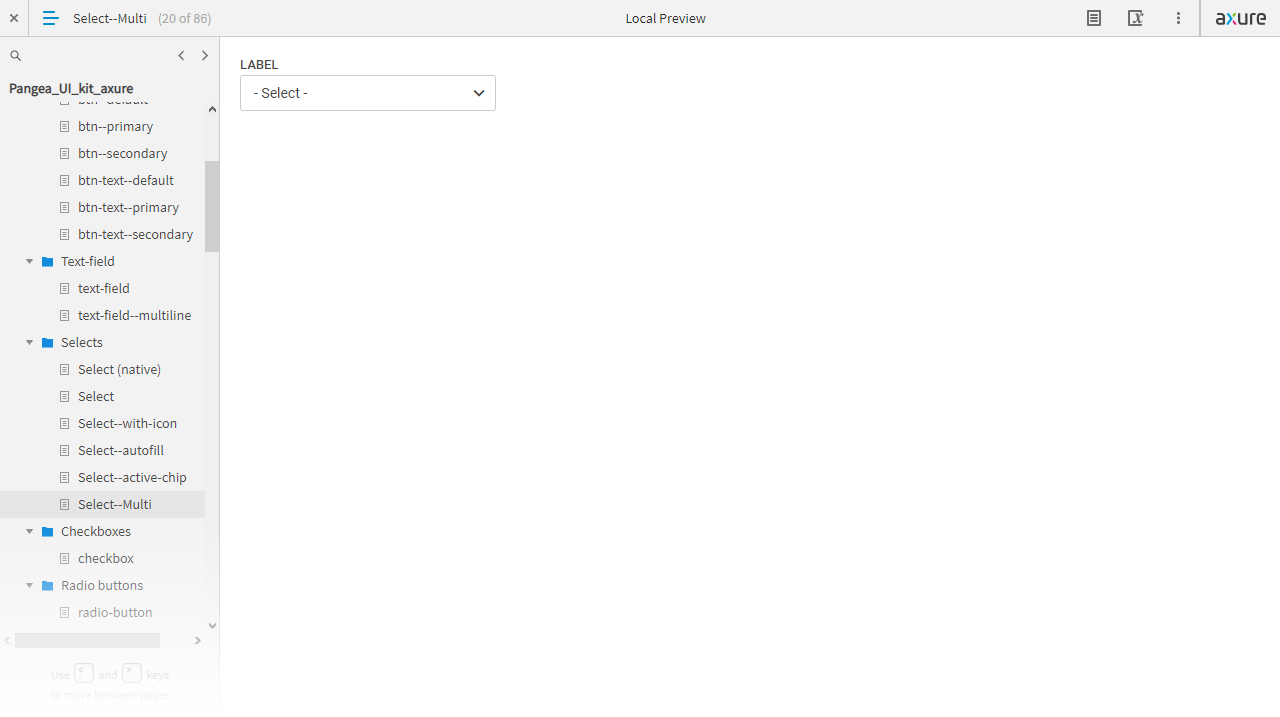
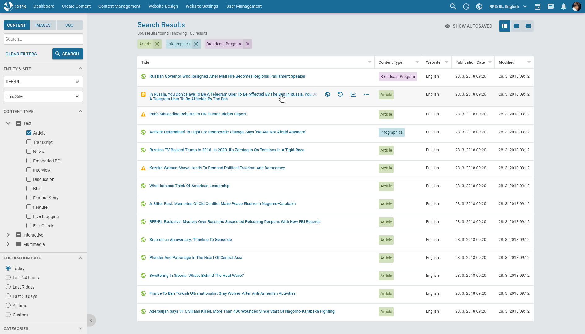
Even though the development process had to continue, I took the initiative and started building an updated UI kit and revisited versions of new CMS pages. My goal was to create a design system which is perfectly systematic, usable for all the related apps, well usable on smaller devices and perfectly accessible. My vision was well accepted by the management and we set a plan for further design and development.
Components
The case of responsive tables
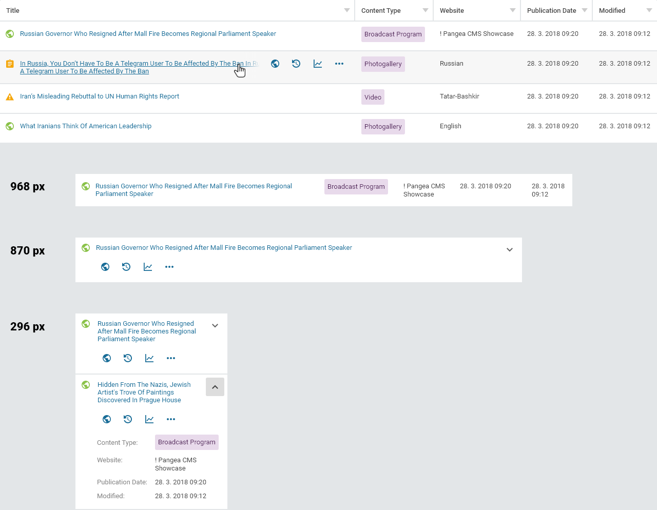
One of the most interesting components I designed for the design system was a table, or rather a system of responsive tables. The system was based on my own analysis of approximately 100 tables in the old CMS and tables in two other apps. Inspired by solutions in WordPress, Google apps and Microsoft 365, I created a following design, solving problems of the original tables which were hiding important information on smaller devices and were not applicable for all the various types of data.
UX writing rules & design patterns
I found out very early that the CMS project won't be successful without at least basic UX writing rules. So I set the rules for capitalization and started with defining distinctions between similar words. For example, a difference between words attach, embed and insert or a difference between erase, remove and delete.
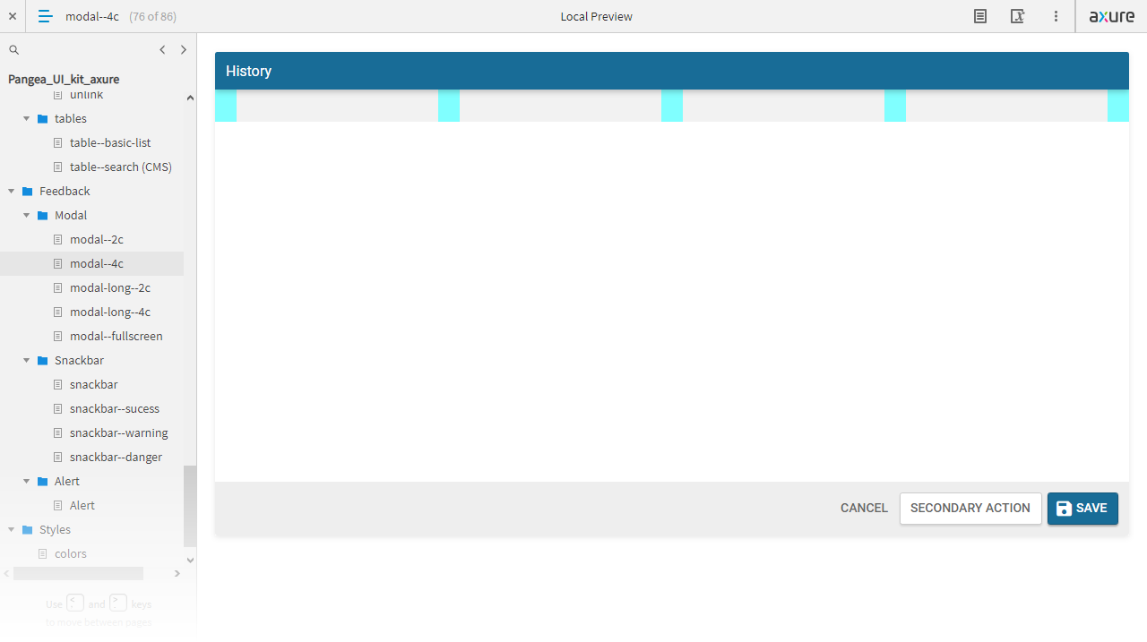
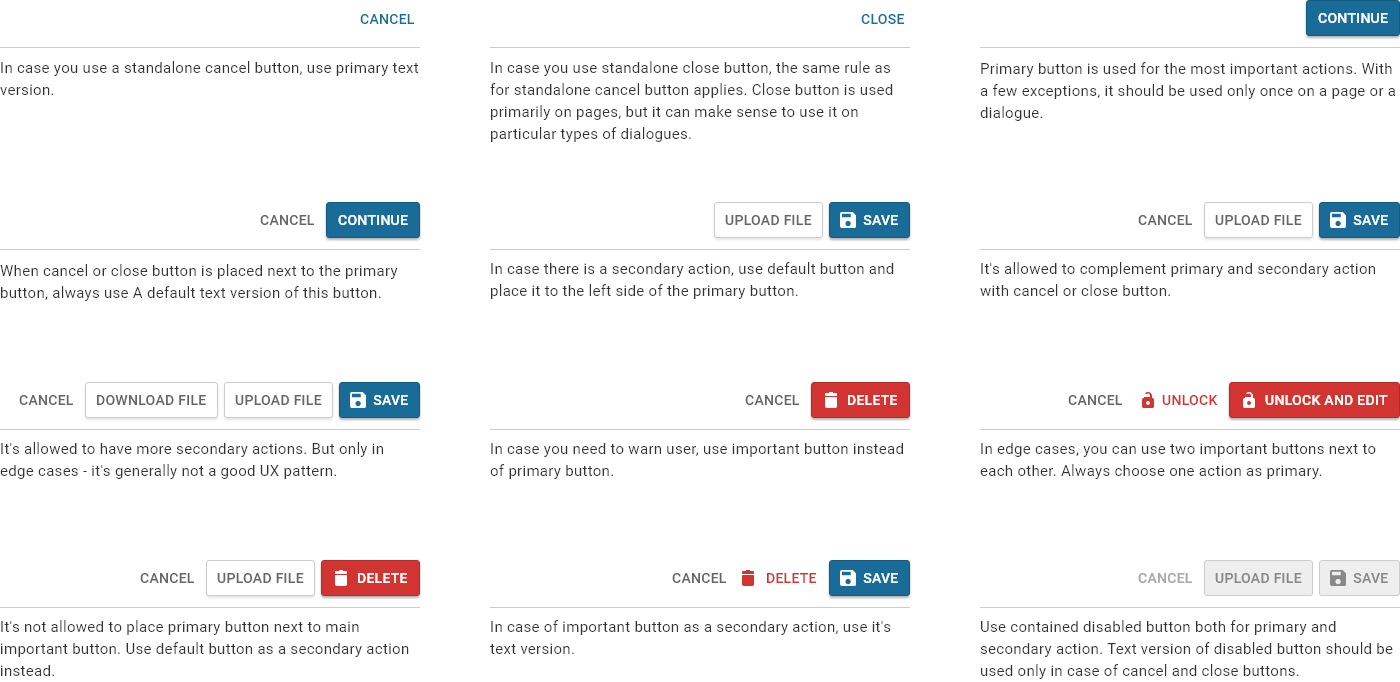
As soon as two colleagues joined my team-of-one, we collectively started to create and document design patterns specific for our apps. We were asking questions like: What happens when you delete something? When and how to use autosave? How to order particular components across similar pages? How to order buttons? Simple questions, but rarely simple answers. Below, you can see my answer to the question of a button order.
Technological transformation
Material-UI library & Storybook
It's a well known fact that open-source component libraries can save tons of hours to front-end developers. But what might be surprising is that some of them are on such a high level of maturity that they could be used even for big projects such as CMS. In 2019, we decided to make a courageous step to transform the vast majority of our component library into one of them, a Material-UI react library which was design-wise very close to our system. Despite its similarity, it took a huge effort to undergo this transformation without significant compromises in quality of user interface design. I take it as a big lesson learned in terms of deliberation with developers and as another step in thinking about design from the perspective of code.
Following this transformation, I initiated implementation of StoryBook, a tool for UI development and documentation. Due to this, I had to dig even deeper into code architecture, since I was helping with UI library creation and component customization.

Library of realistic components in Axure
When the version 9 of Axure released, we concluded that this design tool seems to be mature enough to be used as a main design tool for CMS. It gave us a chance to make realistic prototypes in both aspects, functional and visual. These prototypes were not only better for design-to-development handoff, but also for usability testing. So we collectively built a library of fully interactive components which was previously made in Adobe XD.
As the saying goes, the devil is in the detail, so based on my experience, I have to admit that this approach was far from perfect. Axure can be buggy, slow and a creation process could become overly time-consuming. Sadly, there's no universal tool which meets all the needs of today's designer. One had to always consider which tool to use prior to every task with respect to its specifics.
Design system used in all apps
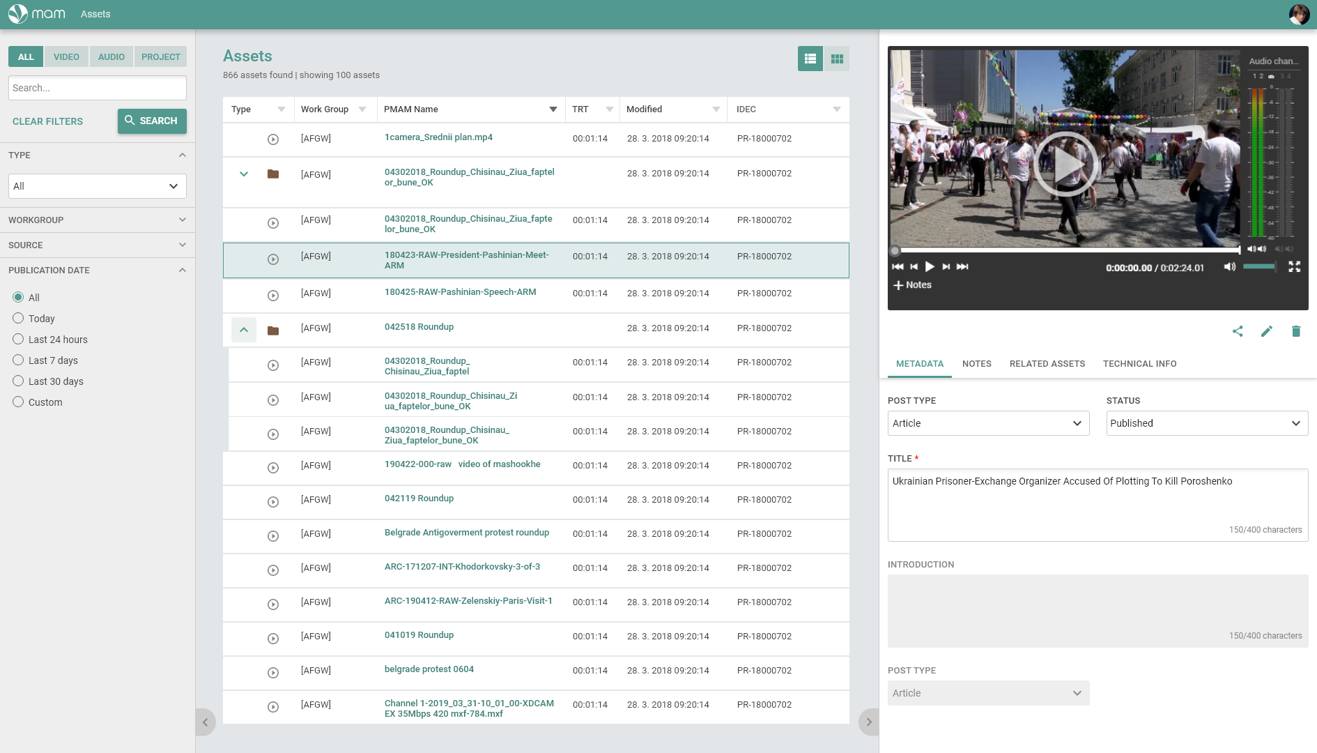
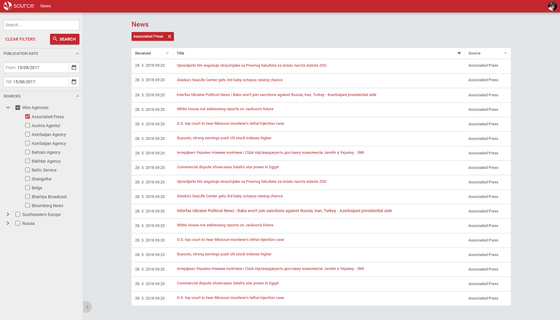
One of my original goals was to create a design system which will be applicable in other apps made by the team, specifically media asset management app, news aggregator and upcoming storytelling page builder. This move was very much needed due to management's plan to integrate all the products into one ecosystem.
New menu structure
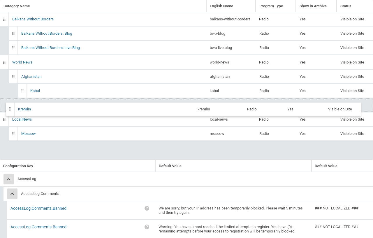
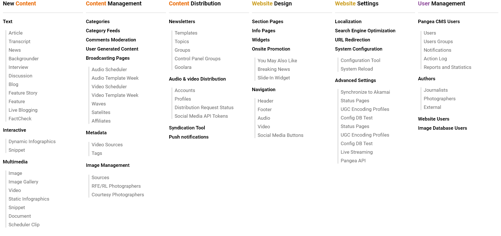
Menu of the old CMS was far from ideal. Even myself, whose job was to create new features for the system, often got lost. That's why I decided to make a following exercise. I found an underlying logic of all the categories and based on that came up with a new structure. Although this attempt was very much appreciated, there are still some jobs to be done before the new menu gets implemented. Specifically, a more in-depth review of Google Analytics, card sorting and interviews with the users.
Comments moderation case study
In 2020, I had a hands-on prototyping new comments moderation page. In addition to improvement of UX there wasn't any clear goal set at beginning, however, I found out very early that many sites completely turned off comment section because moderation was too time-consuming for journalists. Keeping this on my mind, I started my learning journey to be able to improve experience of active users, but also to appeal to those who gave up on having a comment section on their website.


Introductory research
The first stage of the job consisted in detailed research. I went through the relevant discussions on UX Stack Exchange forum, got an overview of comment sections on big media news sites, the solution of comment moderation in various content management systems and even on Facebook. This background knowledge allowed me to prepare good scenarios for structured interviews, which I conducted with the individual newsrooms. I was evaluating reported experience with comments sections and moderation from the perspective of workflows and aimed at identifying the pain points of the current comment moderation page.
User interviews — key findings
According to all journalists, comments moderation is time-consuming, however, comments are very valuable for them and influence their work.
There is always only one on-duty moderator who moderates comments for the whole site. This moderator sometimes needs to send controversial comment to a colleague for review.
During the weekend, journalists on-duty often moderate comments on their mobile phones.
Journalists are not much in favor of opening a comment section only for registered users, because it creates a barrier.
People accuse journalists of censorship.
The percentage of unpublishable comments varies greatly. It can be a very high number (up to 90%) or a relatively low number (around 30%). Moderators sometimes have to deal with spam, but bigger problem is trolling and violation of comment section rules.
Facebook comments are not always better in terms of bringing more civility into discussions.
Journalists would appreciate a search function in a comment moderation section as they sometimes search for older comments.
Solution
I evaluated two most efficient tools regarding the problem of time-consuming moderation: 1) Perspective API from Google, an AI based tool providing authors with a real-time feedback on comments suspect of violating community guidelines and 2) Coral Project, an open-source comments section from VOX media that makes moderators' life easier. Unfortunately, these tools lack eastern languages support, therefore they were unsuitable in our case.
So how to lower the number of trolls and forum rules violation? Firstly, IP blocking is mostly ineffective and runs the risk of blocking legitimate users who happen to share IP space with the trolls. Secondly, registration barrier, which I would recommend, doesn't have to be necessarily significantly effective and journalists generally didn't want to create this barrier.
My solution of the problem consisted from two parts. On a backend side, I recommended implementing profanity filter and spam filter, on a public website – inspired by the Coral project – I recommended adding following notice.
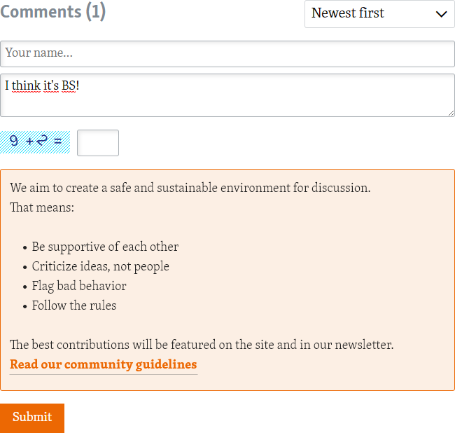
I also helped to solve other minor issues. For example, I added “copy link” button, so a journalist can easily share controversial comments with colleagues. Some demands, like good usability on mobile devices or bigger “Approve” and “Disapprove” buttons were solved automatically by using components from the design system. The final interactive mockup, reviewed together with active comments moderation users is below.
